Difference between revisions of "Carousel"
From Tweeki
| Line 94: | Line 94: | ||
| − | |||
| − | |||
| − | |||
<pre> | <pre> | ||
{{Carousel | {{Carousel | ||
| − | |Image1= | + | |Image1=Screenshot_tweeki.png |
| − | |Title1= | + | |Title1= Screenshot 1 |
| − | |Caption1= | + | |Caption1= Website of Tweeki |
| − | |Image2= | + | |Image2=Screenshot_skrifo.png |
| − | |Title2= | + | |Title2= Screenshot 2 |
| − | |Caption2= | + | |Caption2= Website made with Tweeki |
| − | |Image3= | + | |Image3=Screenshot_tweeki.png |
| − | |Title3= | + | |Title3= Screenshot 3 |
| − | |Caption3= | + | |Caption3=Website of Tweeki |
| − | |Image4= | + | |Image4=Screenshot_skrifo.png |
| − | |Title4= | + | |Title4= Screenshot 4 |
| − | |Caption4= | + | |Caption4= Website made with Tweeki |
| − | |Image5= | + | |Image5=Screenshot_tweeki.png |
| − | |Title5= | + | |Title5= Screenshot 5 |
| − | |Caption5= | + | |Caption5=Website of Tweeki |
}} | }} | ||
| − | |||
| − | |||
| − | |||
| − | |||
| − | |||
| − | |||
| − | |||
| − | |||
| − | |||
| − | |||
| − | |||
| − | |||
| − | |||
| − | |||
| − | |||
| − | |||
| − | |||
| − | |||
| − | |||
| − | |||
| − | |||
| − | |||
| − | |||
| − | |||
| − | |||
| − | |||
| − | |||
| − | |||
| − | |||
| − | |||
| − | |||
| − | |||
| − | |||
| − | |||
| − | |||
| − | |||
| − | |||
| − | |||
| − | |||
| − | |||
| − | |||
| − | |||
| − | |||
| − | |||
| − | |||
| − | |||
| − | |||
| − | |||
| − | |||
| − | |||
| − | |||
| − | |||
| − | |||
| − | |||
| − | |||
| − | |||
| − | |||
| − | |||
| − | |||
</pre> | </pre> | ||
Revision as of 17:19, 6 June 2018
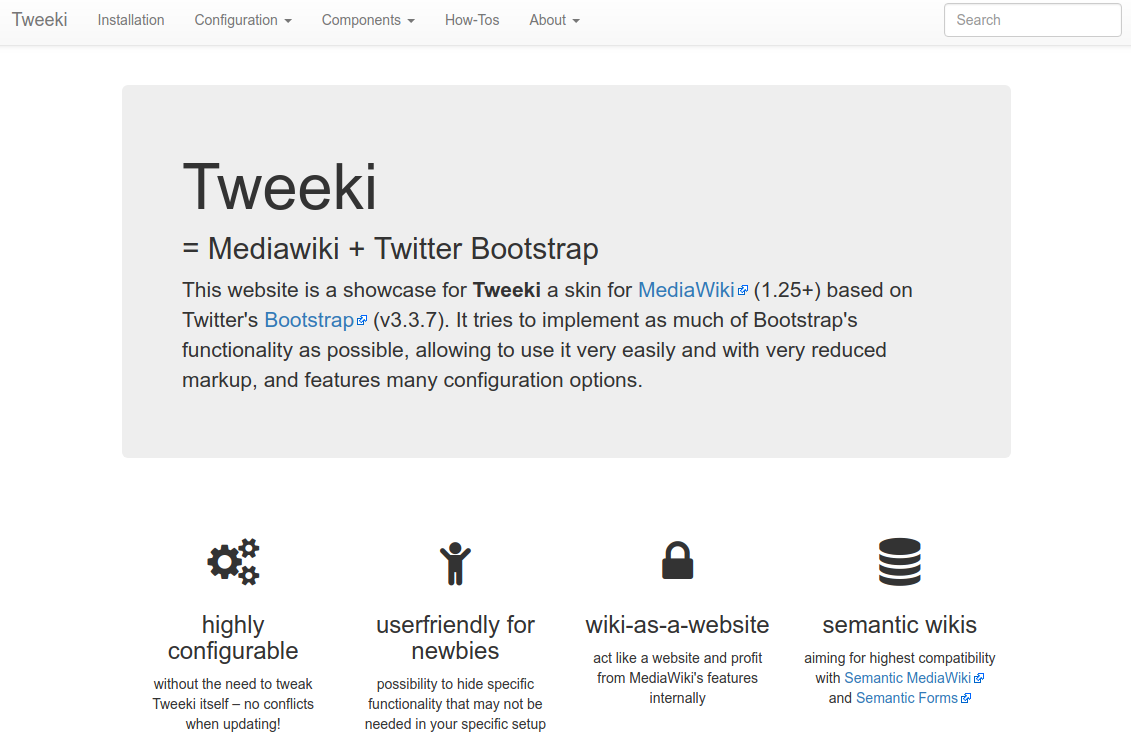
This page exists just for testing purposes. Carousels are not currently supported by Tweeki out of the box. Patches with CSS fixes and the necessary code to allow the
data-slider attribute in btn elements are warmly welcome.This said, there is couple of workarounds, that you could use if you're really eager to get a carousel on you wiki:
- Use the standard Bootstrap-slider carousel without the controls
- Use the extension Widgets if you need a full functioning carousel
Additionally, you can also adapt the standard Bootstrap slider to a fading carousel. This will make your carousel less "flashy". You will have to skip the controls part of the carousel as well, though.
Standard carousel without controls
This is the more-or-less standard bootstrap carousel code, with the controls part removed. Then, only the images are adapted to wiki text:
<div id="carousel-example-generic" class="carousel slide" data-ride="carousel">
  <!-- Indicators -->
  <ol class="carousel-indicators">
    <li data-target="#carousel-example-generic" data-slide-to="0" class="active"></li>
    <li data-target="#carousel-example-generic" data-slide-to="1"></li>
    <li data-target="#carousel-example-generic" data-slide-to="2"></li>
  </ol>

  <!-- Wrapper for slides -->
  <div class="carousel-inner" role="listbox">
    <div class="item active">
      [[File:Screenshot_tweeki.png|link=Mainpage|class=img-responsive]]
      <div class="carousel-caption">
        <h3 style="color: red">Caption 1</h3>
      </div>
    </div>
    <div class="item">
      [[File:Screenshot_skrifo.png|link=Mainpage|class=img-responsive]]
      <div class="carousel-caption">
        <h3 style="color: red">Caption 2</h3>
      </div>
    </div>
    <div class="item">
      [[File:Screenshot_skrifo.png|link=Mainpage|class=img-responsive]]
      <div class="carousel-caption">
        <h3 style="color: red">Caption 3</h3>
      </div>
    </div>
  </div>

  <!-- Controls removed -->
</div>
NB: Make sure to remove all the indents (spaces), or they will mess up the layout!
Example Standard Carousel - no controls
This is what the result of the code above will look like:
Caption 1

Caption 2
Caption 3
Bootstrap carousel using the Widget extension
TBD
Using custom styling and template for Bootstrap carousel
WORK IN PROGRESS
{{Carousel
|Image1=Screenshot_tweeki.png
|Title1= Screenshot 1
|Caption1= Website of Tweeki
|Image2=Screenshot_skrifo.png
|Title2= Screenshot 2
|Caption2= Website made with Tweeki
|Image3=Screenshot_tweeki.png
|Title3= Screenshot 3
|Caption3=Website of Tweeki
|Image4=Screenshot_skrifo.png
|Title4= Screenshot 4
|Caption4= Website made with Tweeki
|Image5=Screenshot_tweeki.png
|Title5= Screenshot 5
|Caption5=Website of Tweeki
}}