Difference between revisions of "How-Tos"
m (→Add custom CSS: small additions) |
|||
| Line 62: | Line 62: | ||
See [http://getbootstrap.com/docs/3.3/css/#images-responsive Bootstrap documentation] for details on <code>img-responsive</code> | See [http://getbootstrap.com/docs/3.3/css/#images-responsive Bootstrap documentation] for details on <code>img-responsive</code> | ||
| + | |||
| + | === Example: Using grids === | ||
| + | |||
| + | One of the major features of Bootstrap is the use of "grids", which can make your website responsive and adapt automatically to the size of the media (screen size). Consider this example with 3 panels in a grid width one row and three columns (on large screens). | ||
| + | Then see what it does when you change the size of your browser window. | ||
| + | |||
| + | <pre> | ||
| + | <div class="flex-row row"> | ||
| + | <div class="col-xs-12 col-md-6 col-lg-4"> | ||
| + | <div class="panel panel-default"> | ||
| + | <div class="panel-heading">Title 1</div> | ||
| + | <div class="panel-body">[[File:Screenshot tweeki.png|200px| link=]] | ||
| + | </div> | ||
| + | <div class="panel-footer">Footer text 1</div> | ||
| + | </div><!-- End of pan --> | ||
| + | </div><!-- end of col 1--> | ||
| + | |||
| + | <div class="col-xs-12 col-md-6 col-lg-4"> | ||
| + | <div class="panel panel-default"> | ||
| + | <div class="panel-heading">Title 2</div> | ||
| + | <div class="panel-body">[[File:Screenshot tweeki.png|200px| link=]] | ||
| + | </div> | ||
| + | <div class="panel-footer">Footer text 2</div> | ||
| + | </div><!-- End of pan --> | ||
| + | </div><!-- End of col 2--> | ||
| + | |||
| + | <div class="col-xs-12 col-md-6 col-lg-4"> | ||
| + | <div class="panel panel-default"> | ||
| + | <div class="panel-heading">Title 3</div> | ||
| + | <div class="panel-body">[[File:Screenshot tweeki.png|200px| link=]] | ||
| + | </div> | ||
| + | <div class="panel-footer">Footer text 3</div> | ||
| + | </div><!-- End of pan --> | ||
| + | </div><!-- End of col 3--> | ||
| + | |||
| + | </div><!-- End of row 1--> | ||
| + | </pre> | ||
| + | |||
| + | And the result looks like this: | ||
| + | |||
| + | <div class="flex-row row"> | ||
| + | <div class="col-xs-12 col-md-6 col-lg-4"> | ||
| + | <div class="panel panel-default"> | ||
| + | <div class="panel-heading">Title 1</div> | ||
| + | <div class="panel-body">[[File:Screenshot tweeki.png|200px| link=]] | ||
| + | </div> | ||
| + | <div class="panel-footer">Footer text 1</div> | ||
| + | </div><!-- End of pan --> | ||
| + | </div><!-- end of col 1--> | ||
| + | |||
| + | <div class="col-xs-12 col-md-6 col-lg-4"> | ||
| + | <div class="panel panel-default"> | ||
| + | <div class="panel-heading">Title 2</div> | ||
| + | <div class="panel-body">[[File:Screenshot tweeki.png|200px| link=]] | ||
| + | </div> | ||
| + | <div class="panel-footer">Footer text 2</div> | ||
| + | </div><!-- End of pan --> | ||
| + | </div><!-- End of col 2--> | ||
| + | |||
| + | <div class="col-xs-12 col-md-6 col-lg-4"> | ||
| + | <div class="panel panel-default"> | ||
| + | <div class="panel-heading">Title 3</div> | ||
| + | <div class="panel-body">[[File:Screenshot tweeki.png|200px| link=]] | ||
| + | </div> | ||
| + | <div class="panel-footer">Footer text 3</div> | ||
| + | </div><!-- End of pan --> | ||
| + | </div><!-- End of col 3--> | ||
| + | |||
| + | </div><!-- End of row 1--> | ||
| + | |||
| + | Please refer to the [http://getbootstrap.com/docs/3.3/css/#grid Bootstrap documentation] for all details on grids. | ||
=== Add custom CSS === | === Add custom CSS === | ||
Revision as of 14:47, 2 May 2018
Complete example configurations
Have a look at the Setup for tweeki.thai-land.at or the much more elaborate Setup for skriptenforum.net.
You can use the {{#tweekihide:}} parser function. See the documentation on navigation to see a list of navigational sections and elements that can be hidden via this function.
Example: if you want to hide the right sidebar on the main page, add the code {{#tweekihide:sidebar-right}} to the page's content.
Just add the navigational sections and elements you want to hide for anonymous users to the $wgTweekiSkinHideAnon array in LocalSettings.php, e.g.
$wgTweekiSkinHideAnon = array( 'navbar' );
You can either use Mediawiki's default mechanisms or you can add your own link or any navigational section or element by placing it in MediaWiki:Tweeki-footer or MediaWiki:Tweeki-footer-custom. See also the detailed Footer Examples.
You just have to find out the id of the element and then edit MediaWiki:Tooltip-MY-ID and MediaWiki:Accesskey-MY-ID. If would like to have a tooltip and/or an accesskey for the toolbox dropdown you would just have to change the content of MediaWiki:Tooltip-p-toolbox and MediaWiki:Accesskey-p-toolbox.
If you define your own navigational element in your extension or in LocalSettings.php, you can apply whatever logic you want. Your custom function should return a string that can be interpreted as a button.
Definition in LocalSettings.php (or in your extension):
$wgTweekiSkinNavigationalElements['MYNAV'] = 'mynav';

function mynav( $skin, $context ) {
    $categories = $skin->getSkin()->getTitle()->getParentCategories();
    if( is_array( $categories ) && array_key_exists( 'Category:MyCategory', $categories ) ) {
        return 'myLink';
    }
}
Now you can use MYNAV in any navigational section (e.g. the sidebar) and the link/button will only be shown on pages that belong to category 'MyCategory'.
Styling
Tweeki comes standard with Twitter Bootstrap 3.3.7 installed; Common CSS, Components and Javascript components are all installed.
So don't forget to check Bootstrap 3.3 documentation for all available styling options! Note that not all components are compatible with wiki text! Several Bootstrap components have been adapted for use with Tweeki; please refer to the Components menu above to read those docs.
Example: Responsive Images
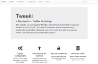
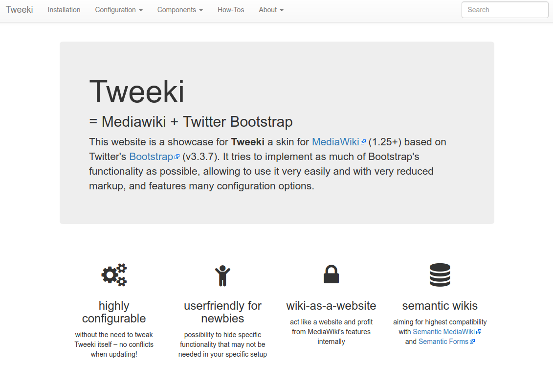
This is a simple example of what Bootstrap can do to help you style your images. To make images responsive and scales to the parent element, within Tweeki just apply the class=img-responsive to the image within the wiki text.
[[File:Screenshot tweeki.png|class=img-responsive]]
Result (make your browser window wider and/or narrower to see the image of the screenshot resize automatically ):
See Bootstrap documentation for details on img-responsive
Example: Using grids
One of the major features of Bootstrap is the use of "grids", which can make your website responsive and adapt automatically to the size of the media (screen size). Consider this example with 3 panels in a grid width one row and three columns (on large screens). Then see what it does when you change the size of your browser window.
<div class="flex-row row">
<div class="col-xs-12 col-md-6 col-lg-4">
<div class="panel panel-default">
<div class="panel-heading">Title 1</div>
<div class="panel-body">[[File:Screenshot tweeki.png|200px| link=]]
</div>
<div class="panel-footer">Footer text 1</div>
</div><!-- End of pan -->
</div><!-- end of col 1-->

<div class="col-xs-12 col-md-6 col-lg-4">
<div class="panel panel-default">
<div class="panel-heading">Title 2</div>
<div class="panel-body">[[File:Screenshot tweeki.png|200px| link=]]
</div>
<div class="panel-footer">Footer text 2</div>
</div><!-- End of pan -->
</div><!-- End of col 2-->

<div class="col-xs-12 col-md-6 col-lg-4">
<div class="panel panel-default">
<div class="panel-heading">Title 3</div>
<div class="panel-body">[[File:Screenshot tweeki.png|200px| link=]]
</div>
<div class="panel-footer">Footer text 3</div>
</div><!-- End of pan -->
</div><!-- End of col 3-->

</div><!-- End of row 1-->
And the result looks like this:


Please refer to the Bootstrap documentation for all details on grids.
Add custom CSS
The easiest way to add custom CSS is via the MediaWiki:Common.css or MediaWiki:Tweeki.css system messages. However, it has the drawback that it doesn't get loaded on the login page and user preferences page.
Another possibility is to create your own extension. Place a CSS file in your extension directory. Then in your extension.json file add a Resource Module (replace “MYEXTENSION“ with your extension's name):
…
"ResourceModules": {
		"x.MYEXTENSION.styles": {
			"styles": [
				"x.mystyles.css"
			]
		}
	},
"ResourceFileModulePaths": {
		"localBasePath": "",
		"remoteExtPath": "MYEXTENSION"
	},
 …
Load the module either somewhere in your extension or add the following line to LocalSettings.php:
$wgTweekiSkinCustomCSS[] = 'x.MYEXTENSION.styles';
Attention! Your CSS file will be included via Ressource Loader. As the mechanism seems to sort the files in alphabetical order and you want your stylings to be loaded last (in order to overwrite default stylings) chose a name for your Resource Module accordingly (e.g. start with an 'x' as in the example).
Completely replace bootstrap files with customized versions
You can download your own customized version of bootstrap at getbootstrap.com or get a free bootstrap theme from bootswatch.com. To replace the default styles and scripts create your own extension, put the files in the extension folder and use the $wgTweekiSkinCustomizedBootstrap configuration:
$wgTweekiSkinCustomizedBootstrap = array(
       'localBasePath' => __DIR__,
       'remoteExtPath' => 'MyExtension'
       );
The files should be organized in folders like this (mimicking the original structure from Tweeki):
<MyExtension>
   – bootstrap
     – css
        – bootstrap.min.css
        – bootstrap-theme.min.css
      – js
        – bootstrap.min.js
In order to increase usability Tweeki hides some of MediaWiki's features by default. Some things are really just hidden via CSS. E.g. if you want to see the category links at the bottom of the page, just add #catlinks {display:block;} to your custom CSS.
Layout
Widths
If you want to use the full screen width, set the MediaWiki:Tweeki-container-class message to container-fluid (see Messages/Appearance).
If you want to change the widths for the sidebars and the main content, see Configuration Options/Grids. If you want to have no offset for a page without sidebars, use the following lines in your LocalSettings.php:
$wgTweekiSkinGridNone = array(
  "mainoffset" => 0,
  "mainwidth" => 12
);
Visual Editor
In principle, it should be possible to use Tweeki with VisualEditor. However, as VisualEditor is still in development and therefore a moving target, things can break very easily. I had it working with MW 1.26 and haven't been testing since. Just try it out, any patches are warmly welcome. As a starting point, you'll need this line in LocalSettings.php to make it work:
$wgVisualEditorSupportedSkins[] = 'tweeki';
Logo
If you want to use an image instead of a text link for the “brand” section in the navigation, you can change the content of MediaWiki:Tweeki-navbar-brand to the name of an uploaded file (including the namespace), e.g. File:MyLogo.png (see also the navbar section in the documentation for messages). By default the image will be shown with a height of 40px, use the .navbar-brand img selector to define your custom stylings.
Standard Table Of Contents
If you want to have the usual table of contents at the top of the page, don't use the TOC navigational element in any of the navigational sections. Especially, you'll have to remove it from Mediawiki:Tweeki-sidebar-right as it belongs to this section's default content. On top of that you'll have to make it visible by adding the following line to your custom styles:
#toc {
  display:block;
}
Please be aware that you'll have to add your own stylings in order to make it look nice.
